Most CRO advice gets aimed at the wrong page. A countdown timer on the product page, a brighter add-to-basket button: these are the standard first tries, and neither moves the number, because neither touches where the revenue is actually leaking. The changes that move revenue on a real ecommerce store are structural, not cosmetic: what happens at checkout, what the site looks like on a phone, and what it does the moment something goes wrong.
ecommerce conversion rate optimisation (CRO, the practice of improving the share of visitors who complete a purchase) has a real priority order, and it is not the one most listicles suggest. Checkout friction costs you buyers who were already committed to paying, mobile is the majority of your sessions on most stores, product pages convert by removing doubt rather than adding persuasion, delivery and returns clarity decides whether people trust the numbers on the page, and untested error states quietly turn paying customers away. This article covers each of those in roughly the order they move revenue, a named failure mode worth avoiding, why average order value is often the easier lever to pull than the conversion rate itself, and when none of this is the priority yet, written for the store owner who has already tried the standard advice and wants to know what is actually worth doing first.
It sits alongside what a CRO audit should cover, which explains how to check the numbers underneath before you change anything; this one is about where to point the work once you trust them.
Checkout is where the revenue is actually leaking
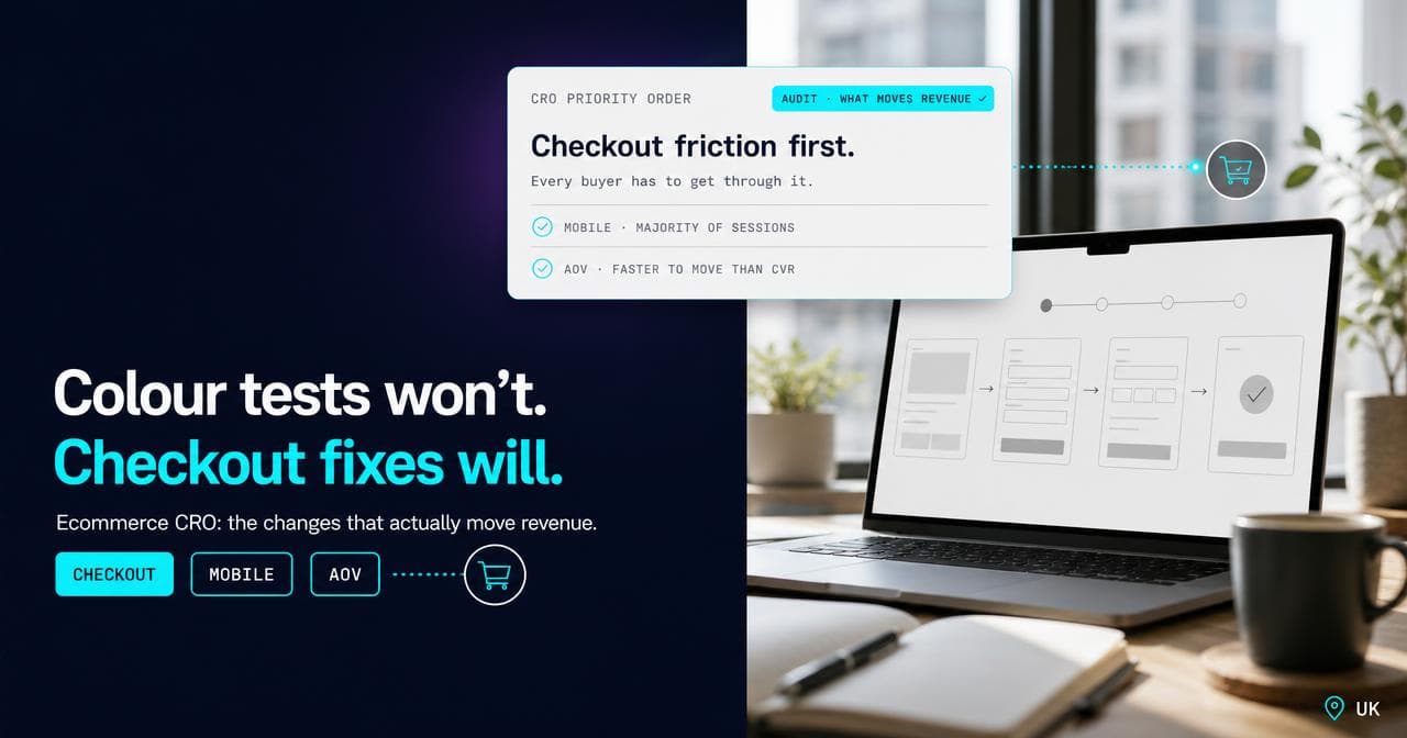
Checkout is the one page in the whole store that every single buyer has to get through. A homepage redesign only reaches the visitors who land there, and a product-page rewrite only reaches the people who open that page. Checkout is different: it catches everyone who was about to pay. That is why I check checkout before I form an opinion about anything else on the site: friction there costs more than friction anywhere else, because it never misses a buyer.
Baymard Institute's ongoing research into cart abandonment puts extra costs, shipping, tax and fees appearing late in the flow, as the single most cited reason shoppers give for abandoning: 40% of shoppers who gave a reason other than "just browsing" cited extra costs, and 18% cited being asked to create an account before checking out (Baymard Institute, accessed August 2026). Neither of those is a design problem in the visual sense. Both are checkout-flow decisions.
The guest-checkout question is the cleanest example of the category: letting customers buy without creating an account first is a single decision that touches every visitor who reaches the basket, which is a different order of impact from almost anything you can do on a landing page. It is also the kind of change that sits with whoever owns the checkout code, not the marketing team, which is why it so often stays unfixed long after everyone has agreed it should happen.
Mobile is the majority case, not the edge case
On most of the ecommerce accounts I look at, mobile carries the majority of sessions, and it is still treated in review meetings as the thing to check last, once the desktop version looks right. That ordering is backwards for most stores now, and it shows in what breaks. Galleries crop a product photo to a sliver. A checkout will not reveal the shipping cost until an account exists. An add-to-basket button sits below the fold on a phone screen.
Periodico, a family-run fashion retailer whose headless Shopify storefront BYLT built on Next.js, is a useful concrete example of the difference. The old theme's mobile product page cropped garment photos and buried sizing in a paragraph of text. The rebuild put a proper gallery on screen with no cropped heads, real colour swatches instead of a line of text, a mobile scroll-snap carousel with a sticky add-to-cart bar, and the measurement table structured as data instead of hidden in prose. None of that is a persuasion technique. It is showing a mobile visitor the same information a desktop visitor gets, without making them work for it.
What actually removes doubt, not what the listicles call persuasion
Most CRO advice treats the product page as a persuasion problem: more urgency, more social proof. In my experience, the product pages that convert best usually do the opposite. They remove a specific doubt the visitor already has, rather than adding pressure to a decision they have not finished thinking through.
For a high-consideration purchase, the doubt is usually about the thing itself: what exactly am I buying, and can I trust the seller on the details that are hard to check from a photo. On 18 Carati, the product-page work pushed specification, certification and delivery answers up the page ahead of everything else, because a stone's certification is the fact a buyer actually needs before committing, not a banner telling them stock is low. On Periodico, verified customer reviews sit directly on the product rather than a click away, and the measurement table is structured data rather than a paragraph the visitor has to parse on a phone.
Urgency and social proof are not fake tools. They just sit further down the list than most CRO advice puts them, and they only work once the doubt that is actually stopping the purchase has been answered.
Delivery and returns: say the number, do not make people hunt for it
The extra-costs figure above is really about trust more than price: shoppers do not mind paying for delivery nearly as much as they mind finding out what it costs at the last possible step, after they have already spent mental effort committing to the purchase. The same logic applies to returns. Hiding the returns window until the confirmation email does not make it more generous, it just means the visitor decided without a piece of information they wanted, and some share of them decide not to.
The fix is cheap to build and cheap to run on most platforms: put the delivery estimate and cost, and the returns window, somewhere a visitor sees before checkout, not somewhere they find after. If the number is genuinely bad news, slow or expensive delivery, that is a business problem to solve, not a UX problem to disguise, and disguising it just moves the abandonment from the product page to the checkout page instead of removing it.
Error states and edge cases: the parts nobody tests
Every CRO conversation is about the happy path: the visitor who browses and buys with no friction. Almost nobody tests what the site does when something goes wrong, and the customer who hits that moment is not a browser you are trying to convince. They are a paying customer, already committed, that the site is actively pushing away.
A card gets declined and the error message does not say why. A discount code fails silently. An item goes out of stock between the basket and the payment step and the checkout just breaks instead of explaining what happened. None of this is rare on a store doing real volume, and each instance is a customer who had already decided to buy, which makes it the most expensive kind of lost sale on the site: the acquisition cost is already spent, and the visitor was already sold. Test these paths with the same care as the happy path, not as an afterthought once the main flow works.
The failure mode: testing colour on a checkout that does not work
The clearest version of getting this wrong is running an A/B test on button colour or headline wording on a site where the mobile checkout is genuinely broken. Both changes might report cleanly inside a testing tool. Only one of them can move revenue, because the other is being tested on a page a meaningful share of the store's actual buyers cannot get through in the first place.
This is not a one-off, it is a recurring pattern: a team runs a confident, statistically valid test on a page nobody was struggling to use, while the real leak sits three steps further down the funnel where nobody thought to look, because it felt like infrastructure rather than marketing. The sharpest version I have seen was a store whose testing setup broke the checkout itself, and a day of orders went missing before anyone connected the dip to the experiment. Fix the structural problem first. A/B testing is a genuinely useful tool once the site works. It is not a substitute for checking whether it does.
Average order value: often the easier lever
Revenue from existing traffic breaks down into three multiplied parts: sessions, conversion rate, and average order value. Most CRO effort goes entirely at the middle term, and for good reason: it is the one everyone means when they say "conversion rate optimisation." But it is also the term that needs the most traffic to move with any confidence, because you are trying to detect a shift in the percentage of visitors who buy, and that number moves slowly and noisily on most stores.
Average order value does not have that problem in the same way. A free-shipping threshold set just above the current average basket, or a genuinely relevant bundle at the basket step, changes the size of an order someone has already decided to place, not whether a stranger decides to buy at all. You can usually see the effect faster and with less traffic, because you are counting money in bigger baskets rather than detecting a subtle shift in a percentage. It is not free of trade-offs: a badly built bundle reads as upselling pressure and costs you the trust the last four sections just spent building, so it has to fit the product and the moment, not just the spreadsheet.
What to fix first, in order
This is roughly the order I work through on a real account, ranked by how much revenue a fix touches for how little traffic it needs to prove itself. Checkout friction comes first, because it touches every buyer. Mobile experience is second, because it carries the majority of sessions on most stores. Error and edge-case handling is third, because it turns away customers who had already decided to pay. Product-page doubt-removal is fourth, delivery and returns clarity is fifth because it is cheap to fix and high-trust, and average order value levers come sixth. Page-level A/B testing comes last, once the structural work is done and the site has the traffic to make a test mean anything. What conversion rate optimisation actually means covers that traffic threshold in more depth.
When this is not the priority yet
None of the above is worth doing to a schedule if two things are not already true. First, the numbers measuring it have to be trustworthy: if analytics is duplicating or missing conversions, you can ship every fix on this list and never know which ones worked, which is the reason a real CRO audit checks measurement before it checks anything else. Second, if the store is mid-migration or about to replatform, fixing checkout friction on a version of the site that will not exist in a month is effort spent on the wrong target; get the rebuild live, then start this list on what is actually going to stay.
If the tracking is sound and the platform is not about to change under you, this is genuinely the order worth working through. It is the order BYLT's CRO work follows on real accounts, and the Periodico product-page rebuild is what the mobile and doubt-removal steps of it look like shipped.
Sources.
- Cart Abandonment Rate Statistics — Baymard Institute (accessed August 2026)